The Bourne Identity: What Was the Ottoman For, and Where Does It Belong?
July 15, 2019
by Victoria Mansion Guide Lisa Schinhofen
Victoria Mansion’s blue circular ottoman is hard to miss — due, in part, to its size and its prominent placement in the middle of a given room — and visitors often remark upon it.
Many recognize the ottoman as a type of public seating, having seen something similar in a hotel lobby, train station, art gallery, or shopping mall. To others, it is familiar as a precursor to today’s sectional sofas.
Some visitors have suggested that the ottoman may have played a role in Victorian courting rituals, as it allowed couples to sit next to each other without actually sitting next to each other. A few have asked whether there is storage space under the cushions for magazines. At least one Museum Guide has wondered what the keyholes are for. (The “keyholes” are part of the mechanism that allows for reconfiguration of the seating.)
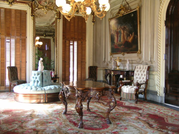
The circular ottoman — also known by other names, including circular sofa, bourne, centre settee, and divan de milieu — was a high-style parlor form characterized by “four open, recessed, and upholstered arms” projecting from its corners, per Field Guide to American Victorian Furniture, or, alternatively, “made in the Turkish style like a Turkish chair,” and was “used extensively in ornate drawing rooms or hotel lobbies and similar public places.”
In Culture & Comfort: Parlor Making and Middle-Class Identity, 1850-1930, Katherine C. Grier describes the Morses’ circular ottoman as a bourne, “the large, round, fabric-covered couch designed to occupy the center of rooms. The bourne was a French innovation, its design a reflection of the ‘Turkish taste’ which was one aspect of French decor throughout the nineteenth century.”
One of the key features that made the circular ottoman a decided asset to the fashionable Victorian parlor was its versatility. The 1851 Great Exhibition catalogue entry for an ottoman exhibited by Maison Balny Jeune, of Paris, reads as follows: “Centre seat for a drawing-room, which can easily be altered into various forms to suit different occasions. It will form a large sofa for eight persons; it can also be changed to a sofa of the ordinary size, and two armchairs, or two sofas vis-à-vis.”
Complementing the ottoman’s functional attributes were its decorative possibilities. Critiquing the same M. Balny exhibition piece, Art-Journal praises its “very elegant and novel mode of treating an article of furniture which, in general, has nothing to recommend it but unadorned utility.” Balny “has shown how such objects may be made elegant and artistic, by using the centre of the ottoman as a pedestal for a statue; the idea has both novelty and ingenuity to recommend it.” (Art-Journal’s engraving of M. Balny’s ottoman can be seen at https://archive.org/details/artjournalillust00bradrich/page/284.)
The nature of the display in the center of the ottoman was limited only by one’s imagination, personal taste, and budget. For instance, a large circular pouffe sofa exhibited at the 1876 Centennial Exposition in Philadelphia boasted at its center a red antique marble fountain surmounted by a candelabrum of bronze. The piece also came with green satin upholstery, chased-bronze frame and legs, and a $10,000 price tag.
French novelists Gustave Flaubert and Émile Zola, meanwhile, adorned fictional ottomans with flower arrangements. (Note that in the following excerpts, one scene takes place in a private home and the other in a public space.)
In the middle of the drawing-room in the home of a prosperous Parisian banker, “under the chandelier, was a vast circular sofa, surrounding a jardiniere full of flowers, which nodded like plumes and overhung the heads of the women sitting round it.” (Gustave Flaubert, Sentimental Education, 1869)
At a bazaar held in the Orangery at the Tuileries in Paris, “there was a low circular velvet settee, with a very sloping back; and in the centre of this circular settee a huge column of flowers shot up, a pillar of stems amongst which hung roses, carnations and verbenas, like a rain of gleaming drops.” (Émile Zola, His Excellency Eugène Rougon, 1876)
One can imagine the Morses’ bronze-patinated spelter statue of “Lorelei” standing on the pedestal in the center of the blue ottoman in the Parlor, echoing the room’s theme of seductive love and, conversely, its perils.
But was the ottoman indeed intended for the Parlor, or was it meant for the Reception Room? Convention and practicality would set it down firmly in the Parlor, but there is evidence that it belongs in the Reception Room. There are also indications that it fully belongs in neither, or in either, or was conceived for one and re-conceived for the other.
In a display case at the back of the Stair Hall is a Morse-era photograph, circa 1874, of the Parlor with no ottoman in sight. (Could it have been in the room but not in the picture?) In a Libby-era photo from 1895, the circular ottoman figures prominently, as circular ottomans do.
Olive Morse’s 1894 room-by-room inventory of the Mansion’s contents, also on display at the Mansion, tells us what was where when she compiled the list: a seven-piece parlor set in the Parlor; a six-piece parlor set in the Reception Room; and “1 Circular Ottoman or Divan” — in the third-floor Billiard Room.
Gustave Herter, the Mansion’s interior designer whose studio manufactured its furnishings, conceived each room as a whole, with its own theme and color scheme, and furnishings unified by the use of identical materials and repeating motifs. This would have been important to Ruggles Morse, as it signified him as someone with the sophistication to appreciate the integrated-design concept and the financial resources to commission its execution.
The ottoman displays neither the carved winged cherub-like figures of the Parlor suite nor the gilded metal masks on the Reception Room furniture — nor, for that matter, does it have legs, arms, or crest rails on which to display them.
On the other hand, the gilded metal bellflower mounts seen on the base of the ottoman repeat those that ornament the legs of the Parlor’s armchairs and the bellflowers on the window cornices. The most obvious evidence placing the ottoman in the Reception Room is its upholstery of pale-blue floral damask, as opposed to the champagne-colored silk that covers the Parlor furniture. (The piece has been re-upholstered, but earlier conservation did not find evidence that the ottoman had been anything but blue.)
Hardware that places the ottoman in the Parlor and fabric that situates it in the Reception Room — did Ruggles Morse, or Morse and Gustave Herter, reconsider the purpose of the ottoman? What would it be for, if not for socializing?
If Ruggles Morse did choose to situate the ottoman in the Reception Room, the hotels that he so masterfully managed may have played a role in that decision. After all, his years as a hotelier informed his aesthetic sensibilities and introduced him to the amenities, conveniences, and comforts he would desire and require in his summer retreat.
According to Herter Brothers: Furniture and Interiors for a Gilded Age, the ground-floor rooms of the Mansion “bespeak grandeur and exude a heavy flavor of Europeanized culture, resembling, in their scale and degree of opulence, those that might be found in imposing public buildings. It seems likely that Morse conceived of the interiors of his house in much the same way he might have decorated his luxury hotels.”
Also elaborating on this theme, Katherine C. Grier writes: “The surviving interiors that probably bear the closest resemblance to public parlors in mid nineteenth-century hotels are to be found in … one with a special connection to the hotel business. … Indeed, the floor plan of the house, with its grand central staircase and large drawing and reception rooms, the elaborate and brightly colored rococo-revival interior painting and architecture details, and the furnishings in the French taste, all recall the descriptions” of first-class hotels.
The Mansion’s Reception Room was the most public of the public rooms, the room to which all visitors were shown, notwithstanding the purpose of their call or even the Morses ‘ inclination to receive them. With the ottoman in it, the Reception Room more closely resembles a hotel lobby in appearance and function. It distinguishes visitors from guests.
Then, as now, lobbies were a fine place for relaxing, taking in one’s surroundings, and watching the world go by; and central seating provided the ideal vantage point. As a pseudonymous contributor to “The Gentleman’s Magazine” (July-December 1875) writes of his visit to the Palais de l’Industrie in Paris for the annual Salon art exhibit: “A circular ottoman of hospitable dimensions stands in the centre of the lobby, enabling the visitor to enjoy a little fresh air and quietly watch the ascent into the show-rooms of a motley public — foreign, French, and Frenchified.”
Reuben Vose, a 19th-century historian of sorts and social critic-at-large, waxes rhapsodic about New York’s Fifth Avenue Hotel in his Wealth of the World Displayed (1859), comparing it to a “marble palace” and praising Amos R. Eno, the man of “boundless wealth” who built it and “modestly declined calling it the Eno House.” To Vose, the hotel is a source of replenishment, admiration, and a kind of good-natured envy.
If slightly fatigued a seat may be occupied in the hotel, and before him will pass more of the real beauty and wealth of the nation than in any other spot in the city. . . .This spot is the only resting place that calls us from the perplexities of business. Here we recover from the toils that recur with every rising sun. Here as we gaze on the Wealth of the World, we feel at “home.” Yielding to the illusion of the place, and to a suggestive imagination, we often fancy that we are the happy owner of all that glides in beauty before us — except the ladies. (Reuben Vose’s Wealth of the World Displayed, 1859)
Having been ushered by a servant into the Morses’ Reception Room, the visitor, with little to do but wait to be received by the Morses, could openly survey the room and linger on its details. The elaborately decorated room with its en-suite parlor set and wall-to-wall carpeting, classical imagery and representations of the creative arts, is meant to convey to the visitor that the Morses are people of wealth, status, refinement, and educated tastes. And there hangs an oil portrait of Ruggles Morse himself: your host and the owner of all you survey, a man worthy of your admiration (and possibly even your envy).
In the small room off the Reception Room stands the magnificent Herter cabinet, a striking blend of materials (bird’s eye maple, rosewood, painted canvas, gilded metal, mirrors), styles (neo-Renaissance, baroque, rococo, neoclassical), colors, and decorative elements. Present-day visitors may think it odd that such an important piece wasn’t more prominently showcased; but what if, on the contrary, that small room off the Reception Room is the showcase?
The Metropolitan Museum of Art’s exhibition catalogue for Art and the Empire City: New York, 1825-1861, which calls the cabinet “the masterpiece of the Morse mansion furniture,” states:
“Herter’s cabinet is an exhibition piece. As the most elaborate object in the house, it stands alone in splendor in a small room that gives onto the reception room. Successive arched doorways and colorfully painted walls and ceiling create a theatrical framework for the cabinet, which, as it is on a perpendicular axis with the front hall, is one of the first things a visitor sees on entering the house.”
This may be the most compelling argument for having the ottoman in the Reception Room. How better to recognize and enjoy a masterpiece than with museum-style seating?
Sources
Ellis, Robert, and John Tenniel. Great Exhibition of the Works of Industry of All Nations, 1851: Official Descriptive and Illustrated Catalogue. London: Spicer Bros., 1851.
https://archive.org/details/b21495361_0003/page/n385
Flaubert, Gustave. Sentimental Education. Translated by Anthony Goldsmith, London: J.M. Dent & Sons, 1914.
https://archive.org/details/in.ernet.dli.2015.149517
Grier, Katherine C. Culture & Comfort: Parlor Making and Middle-Class Identity, 1850-1930. Washington: Smithsonian Institution Press, 1997.
Howe, Katherine S., Alice Cooney Frelinghuysen, and Catherine Hoover Voorsanger. Herter Brothers: Furniture and Interiors for a Gilded Age. New York: The Metropolitan Museum of Art, 1994.
Ingram, J. S. The Centennial Exposition, Described and Illustrated. Philadelphia: Hubbard Bros., 1876.
https://archive.org/details/centennialexposi00ingr/page/456
Ormsbee, Thomas H. Field Guide to American Victorian Furniture. Boston: Little, Brown, 1952.
https://archive.org/details/fieldguidetoamer00orms
Sandoval-Strausz, A. K. Hotel: An American History. New Haven: Yale University Press, 2007.
https://archive.org/details/isbn_9780300106169
Spectavi (pseud.). “Apropos of the Paris Salon.” The Gentleman’s Magazine Jul.-Dec. 1875: 56-63.
https://archive.org/details/gentlemansmagaz109unkngoog
The Art-Journal Illustrated Catalogue: The Industry of All Nations, 1851. London: George Virtue, 1851.
https://archive.org/details/artjournalillust00bradrich/page/284
Voorsanger, Catherine H., and John K. Howat. Art and the Empire City: New York, 1825-1861. New York: The Metropolitan Museum of Art, 2000.
https://archive.org/details/ArtandtheEmpireCityNewYork18251861
Vose, Reuben. Reuben Vose’s Wealth of the World Displayed. New York: R. Vose, 1859.
Ward, Gerald W. R., ed. Perspectives on American Furniture. New York: Published for the Henry Francis du Pont Winterthur Museum by W.W. Norton & Co., 1988.
https://archive.org/details/perspectivesonam0000unse
Zola, Emile. His Excellency Eugène Rougon. London: Vizetelly & Co., 1887.
https://archive.org/details/hisexcellencyeug00zola/page/n6

